1. Description
The Menu Web control is a Visual control used for implementing navigation on a web page.
Class: Menu
Namespace: Sitecore.WebControls
Assembly: menu.dll
2. Installation Guide
The Menu Web Ccontrol is distributed as a standard Sitecore package; hence in order to start using it, you should install the package. Please refer to the 'Installing Modules and Packages' article if you are not familiar with the standard Sitecore Packager tool.
After the package installation, you will see the Menu Web Control in the list of renderings.
Thus, you will be able to place it on a (sub)layout or a link via placeholder like any other rendering.
3. Developer Manual
Valid Properties:
CheckSecurity
Type: System.Boolean
Property value:
true if extranet security should be checked when the control is rendered, otherwise false. The default value is false.
Remarks:
When the CheckSecurity property is true, the Menu Web Control displays only those menu Items that the currently logged extranet User has access to (the read permission is required). This property allows the Menu Web Control to look differently to different Users, depending on their security privileges.
CollapseImage
Type: System.String
Property value:
The name and path of the collapse image file.
Remarks:
The collapse image is displayed near the expanded menu Item when the value of the MenuType property is MenuType.Tree. See the "Product overview" Item image in the picture below.
Example:
m_menu.CollapseImage = "/images/iconLess.gif";
ExpandImage
Type: System.String
Property value:
The name and path of the expand image file.
Remarks:
The expand image is displayed near the menu Item that has children and is not expanded. This property is used only when the value of the MenuType property value is MenuType.Tree. See the "Free modules" Item image in the picture below.
Example:
m_menu.ExpandImage = "/images/iconMore.gif";
NoExpandImage
Type: System.String
Property value:
The name and path of the NoExpand image file.
Remarks:
The NoExpand image is displayed near the menu Item that does not have children. This property is used only when the value of the MenuType property value is MenuType.Tree. See the "Prices" Item image in the picture below.
Example:
m_menu.NoExpandImage = "/images/iconNone.gif";

DefaultSelection
Type: System.String
Property value:
The default selected Item. Can be the Item name or index.
DividerImage
Type: System.String
Property value:
The name and location of the divider image file.
Remarks:
The divider image is used for separating menu Items (it is inserted in between menu Items). This property is usually used when the value of the MenuType property is MenuType.Normal and the value of the Orientation property is ListOrientation.Horizontal
ExcludeTemplates
Type: System.String
Property value:
The coma separated list of template names.
Remarks:
Items based on templates that are listed in the ExcludeTemplates property value will not be displayed in the menu
FriendlyUrls
Type: System.Boolean
Property value:
True, if Friendly URLs should be used for menu Item links. The default value is true.
ImageField
Type: System.String
Property value:
The ame of the field that contains an image to be displayed for the menu Item.
Example:
Suppose, the template that Item is based on contains the "Image" field of the "image" type and this image should be displayed for the menu Item.
The desired effect can be achieved by following call:
m_menu.ImageField = "Image";
ImageHighField
Type: System.String
Property value:
The name of the field that contains the image to be displayed when the cursor is located over the menu Item.
Example:
Suppose, the template the Item is based on contains the "ImageHighlighted" field of the "image" type and this image should be displayed for the menu Item when the mouse cursor is located over the menu Item.
The desired effect can be achieved by the following call:
m_menu.ImageHighField = " ImageHighlighted ";
ImageSelectedField
Type: System.String
Property value:
The name of the field that contains the image to be displayed when the menu Item is selected.
Example:
Suppose, the template the Item is based on has the "ImageSelected" field of the "image" type, and this image should be displayed for the menu Item when it is selected.
The desired effect can be achieved by following call:
m_menu.ImageSelectedField = "ImageSelected";
ItemClass
Type: System.String
Property value:
The CSS class name for menu Items
ItemStyle
Type: System.String
Property value:
The CSS style for menu Items
Example:
To make the text color of menu items blue, use:
m_menu.ItemStyle = "color: #000FFF";
LevelPadding
Type: System.String
Property value:
Additional padding for each menu level in pixels
Levels
Type: System.Int32
Property value:
The number of menu levels.
Remarks:
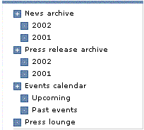
Use value 1 for standard non-hierarchical menus. When the value is greater than one, menu nodes are automatically expanded. The pictures below show the "News" menu of SiteCore 4.3 demo site with Levels=1 and Levels=2
Levels=1:

Levels=2:

LinkField
Type: System.String
Property value:
The name of the field containing a link that should be followed when the menu Item is clicked.
Remarks:
By default, each menu Item contains a link that points to the page from which it is generated. For example, if you have the /Home/Customers node in your content tree, the "Customers" menu Item will take the User to
http://www.yoursite.com/Customers.html. If this is not what you want, you can add a field of the "link" type to the Customers node template, and set the menu’s LinkField property to the name of that field. After that a click on "Customers" menu Item will take the User to whatever location the link field points to.
MenuType
Type: Sitecore.WebControls.MenuType
Property value:
MenuType.Normal is the linear menu. Can be horizontal or vertical, depending on the Orientation property value. The picture below shows an example of horizontal menu of Normal type.

MenuType.Tree is the tree-like menu. The picture below shows an example of a menu with the MenuType property value MenuType.Tree

The default value of the MenuType property is Normal.
Orientation
Type: Sitecore.WebControls.ListOrientation
Property value:
The orientation of the menu. The default value is ListOrientation .Vertical
Padding
Type: System.String
Property value:
Padding of each menu Item in pixels.
PassiveField
Type: System.String
Property value:
The name of the field (checkbox) containing a value indicating that the menu Item should not be clickable.
Remarks:
The PassiveField property allows you to disable some Items in the menu. For example, your menu contains the "Customers" Item and you want it to be disabled. To achieve the desired effect, you need to add the "Disabled" field of the "checkbox" type to the "Customers" Item template and set the check in this field for the "Customers" Item. After that you need to set the value of the menu’s PassiveField property to "Disabled".
RootTemplates
Type: System.String
Property value:
The Coma-separated list of templates names.
Remarks:
The RootTemplates property along with the DataSource property determine the scope of Menu Web Controls, that is which Items are displayed by the control.
If the DataSource property is set, the menu always displays child Items of the DataSource node and their descendants regardless of the current Item. If the DataSource property is not set and the RootTemplates is set, the system checks if the current Item’s template is listed in the RootTemplates. If so, the current Item is used as a data source; if not, the system tries to locate the ancestor of the current Item whose template is listed in the RootTemplates property and use it as DataSource. If both the DataSource and RootTemplates properties are empty, the current Item is used as data source.
SelectedItemClass
Type: System.String
Property value:
The CSS class name for the selected menu Item.
SelectedItemStyle
Type: System.String
Property value:
The CSS style for the selected menu Item.
TextField
Type: System.String
Property value:
The name of the field that contains text to be shown for the menu Item. The default value is "Name".
TreeImageStyle
Type: System.String
Property value:
The CSS style for expansion images.